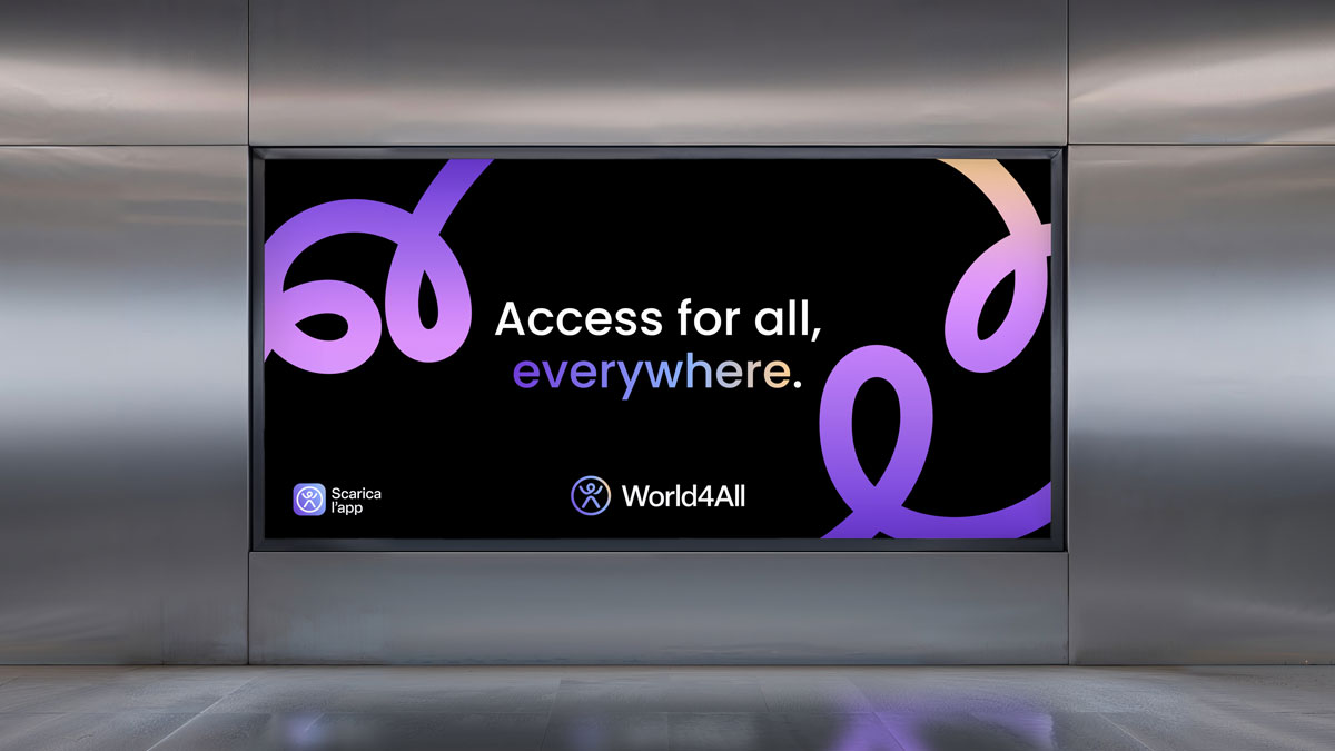
A living sign of accessibility and movement. Design by Monteluna, creative partner of World4All.
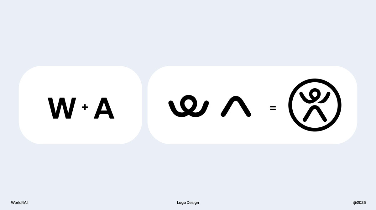
World4All's new logo is not just a graphic sign: it is a gesture.
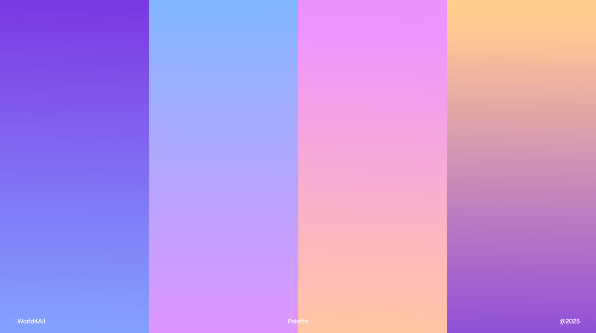
A simple, human, immediate gesture: two arms reaching up not to ask for help, but to affirm presence. “I am here. I can do this. I want to live it.” Monteluna started from the universal icon of accessibility, the motionless one we all know. And transformed it: energy, movement, possibility. The W and the A intertwine and become a dynamic, elastic body, ready to start again. A symbol of momentum for those who every day encounter obstacles invisible to others. Then there is a deliberately imperfect choice: a line that does not close. A visual reminder that no path is the same and that inclusion is born right there, in the space between fragility and strength. On the face, a pin: the symbol of the journey and the freedom to choose where to go. Because accessibility is not the destination: it is the possibility of getting there. Everything is enclosed in a white circle that does not squeeze, but welcomes: a world that includes, without limiting. And the colors speak volumes: purple as dignity and presence, yellow as light and future. This logo is not a label. It is a daily commitment: to transform the world into an accessible, living, full place - for allə.
Share this article on your socials.
We've detected you might be speaking a different language. Do you want to change to: